Client
YTECO
Sector
Healthcare
Discipline
Strategy
Brand identity
Project team
Thanh Binh
Linh Phan
Milan Le
Khanh Linh
Tra Tran
Khoa Huynh
Mash Pham
Doan Thuc
Minh Chau
Challenge
After 39 years as a leader in pharmaceutical supply, Yteco aimed to revamp its organizational structure, seeking a strategic overhaul of its brand identity and messaging. They partnered with xolve to redefine their brand strategy, catering to a diverse clientele across Vietnam’s healthcare sector.
Solution
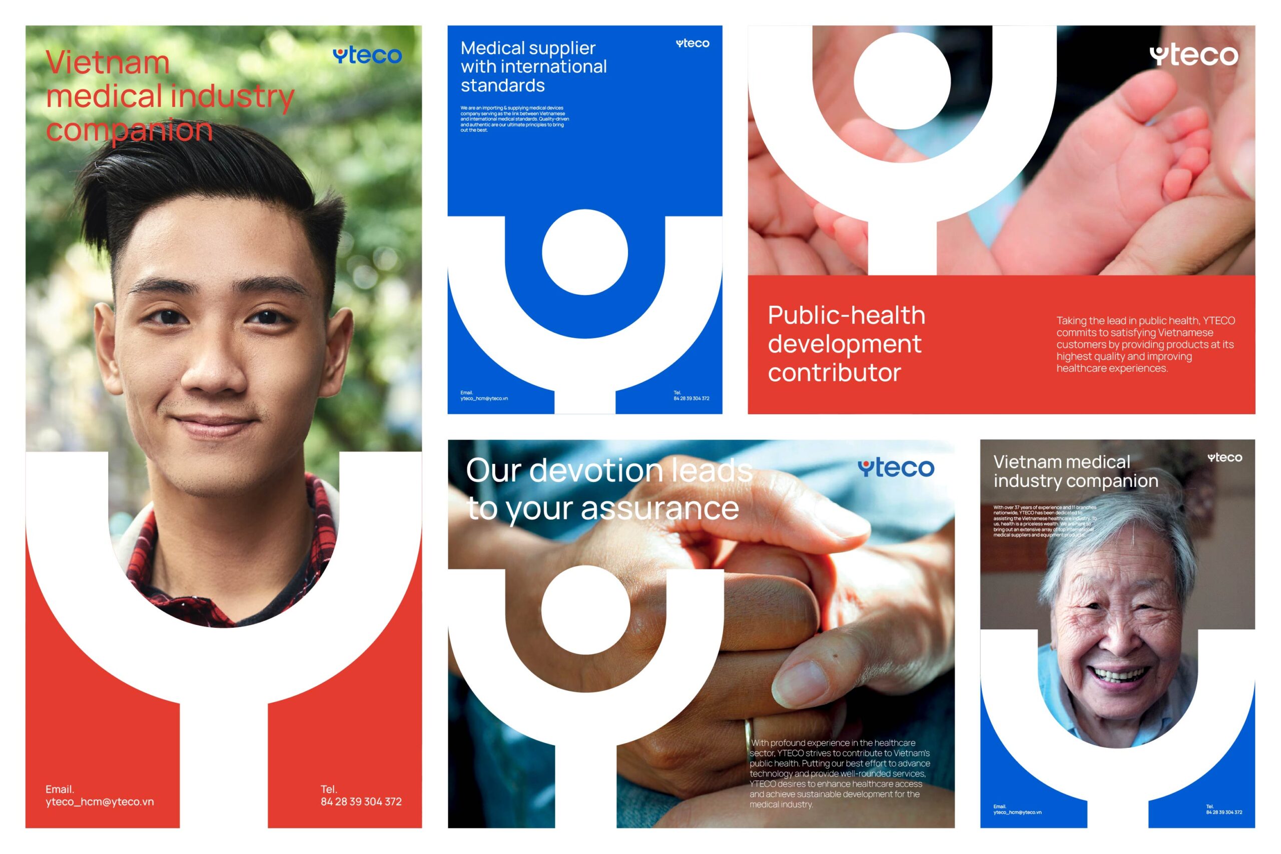
xolve began by segmenting Yteco’s target audiences into four distinct groups, focusing on their unique product needs. Crafting a refined brand messaging strategy, the aim was to enhance communication and reinforce the brand’s values with partners. The communication theme centered on reshaping Vietnam’s medical care standards, prioritizing customer confidence through high-quality products.
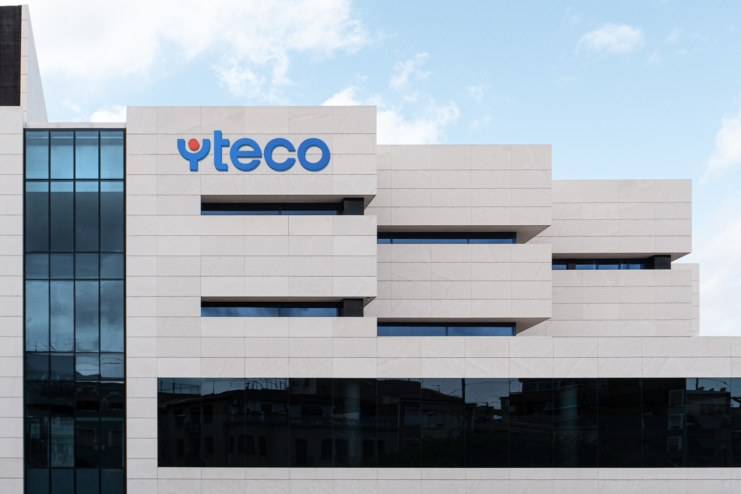
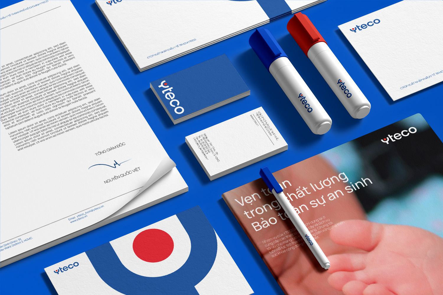
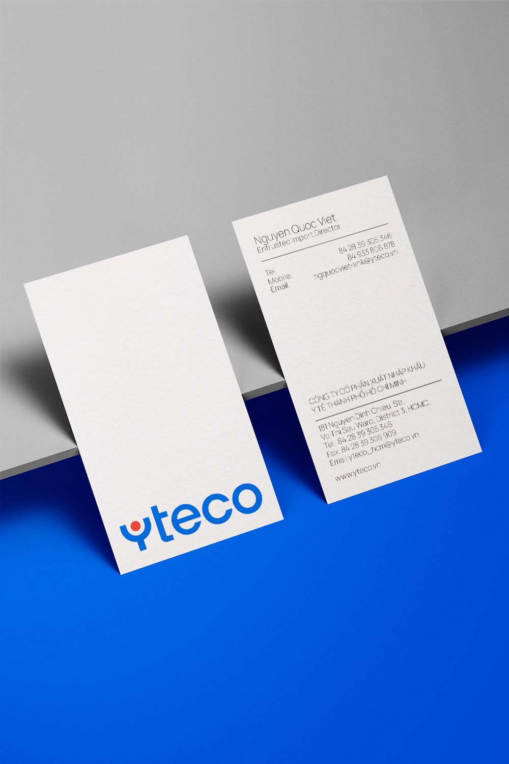
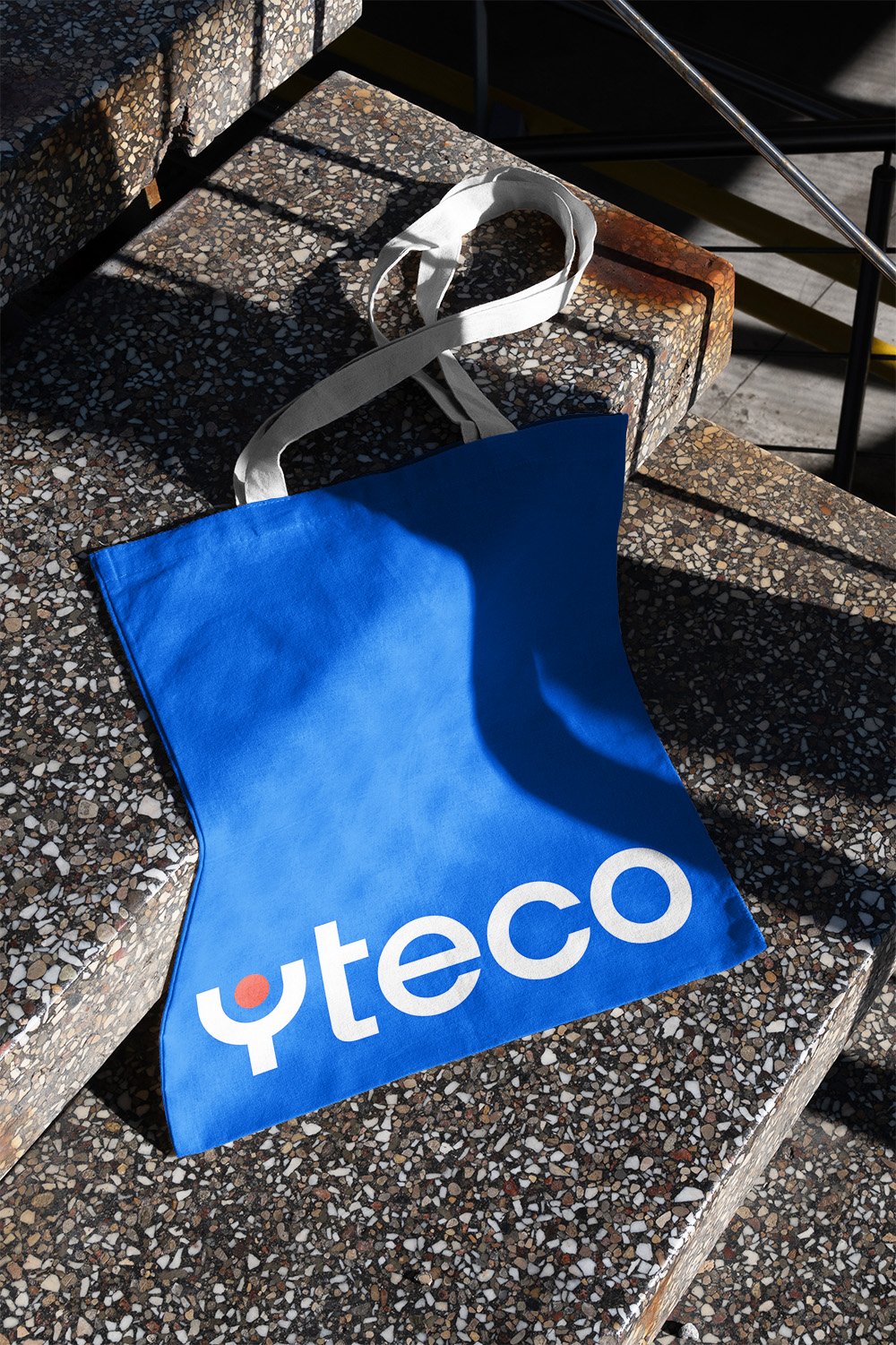
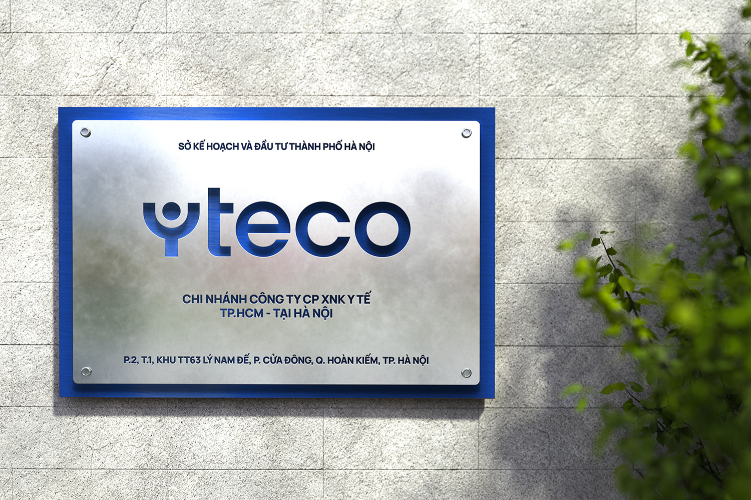
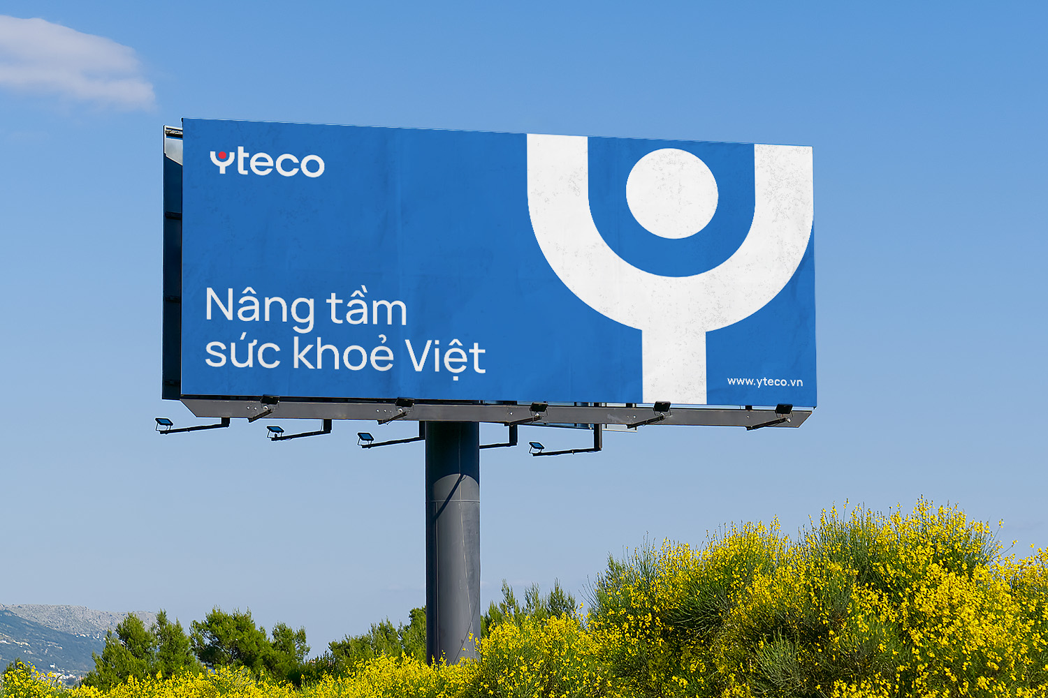
The brand identity redesign was symbolically represented by the incorporation of a red dot within the character “Y,” signifying Yteco’s customer-centric philosophy, symbolizing care and protection for health. This was complemented by an uplifting gesture in the letter “Y,” aiming to elevate Vietnam’s healthcare sector’s quality.
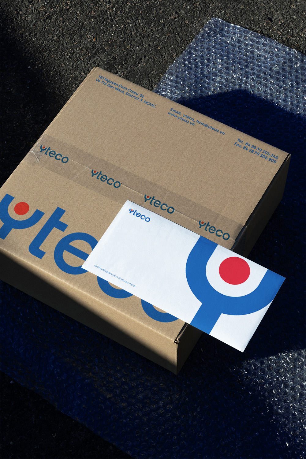
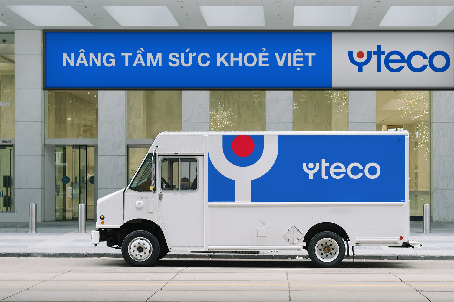
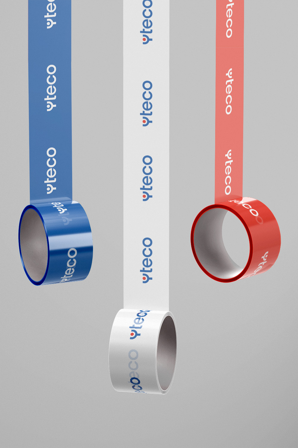
A strategic adjustment to Yteco’s color palette involved brighter and more saturated tones. Blue evoked trust and professionalism, while red conveyed energy and passion, reflecting the dedication of the medical team.
The logo’s distinct “Y” served as a versatile and recognizable brand asset, adaptable across various applications from digital to physical mediums, ensuring scalability and recognition.
Result
In a few months, the collaboration between Yteco and xolve led to the nationwide launch of the revamped brand identity. This partnership reshaped Yteco’s essence and set the stage for future growth. It reflects Yteco’s commitment to customers and its aim to elevate healthcare standards. The successful rollout of the revamped identity serves as a testament to the synergy between Yteco’s legacy and its future aspirations.
