Client
Barson
Sector
Food and Beverage
Discipline
Strategy
Brand identity
Packaging
Project team
Quyen Tran
Ai Quynh
Linh Phan
Toan Pham
Anh Chu
Jei Nguyen
Mash Pham
Nhu Lam
Khoa Huynh
Challenges
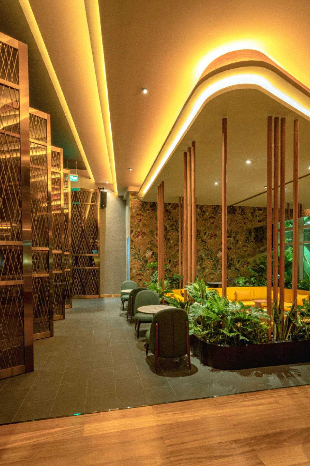
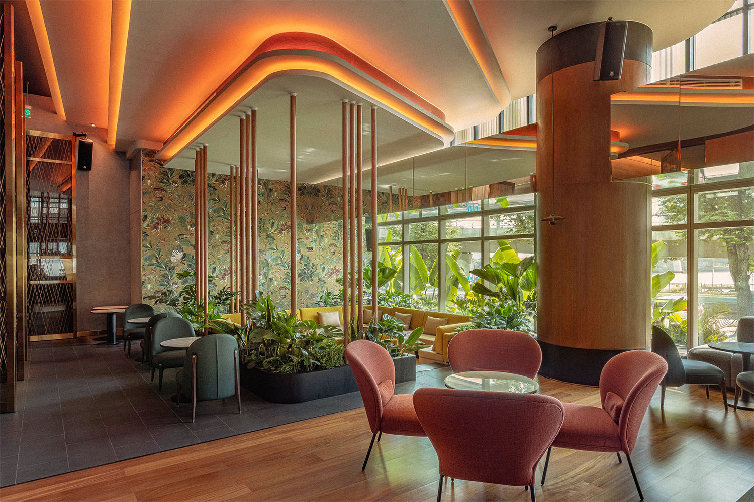
The nightlife scene in Ba Son area was missing something special—a place that would redefine the city experience. A place that didn’t just serve delightful dishes but also created an atmosphere where every evening felt like a celebration. Barson identified this gap and aimed to establish itself as the ultimate destination for every night out.
Solution
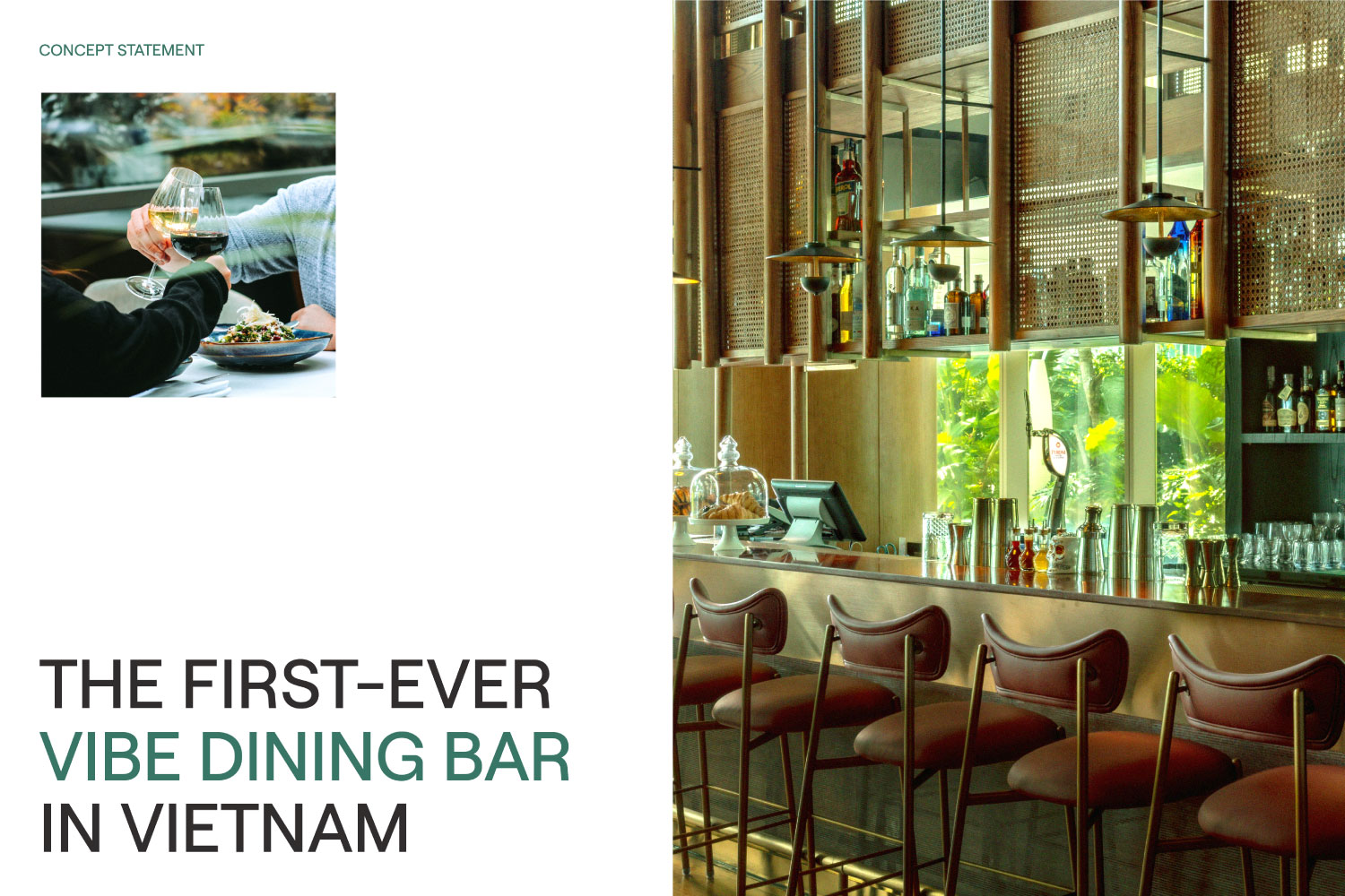
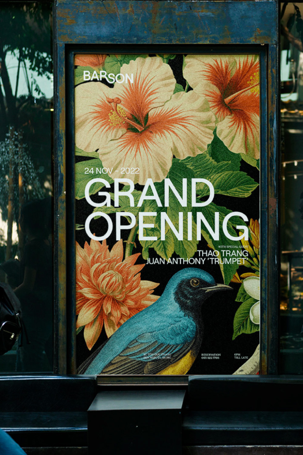
To achieve this, Barson embarked on transforming Vietnam’s nightlife scene by introducing the new concept of vibe-dining. Inspired by Sai Gon City’s maritime history at Ba Son, the bar cleverly integrated historical context into its modern allure. The strategy focused on highlighting Barson’s functional value as a vibe-dining bar while accentuating an emotional connection to the high-profile Ba Son area. This positioning dubbed Barson as “The go-to vibe dining in Ba Son.”
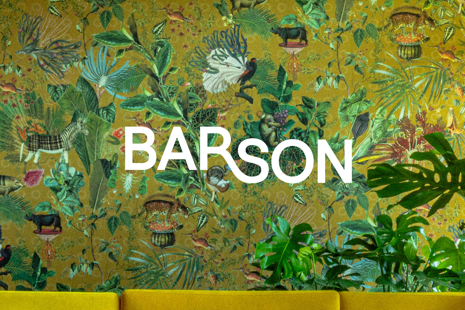
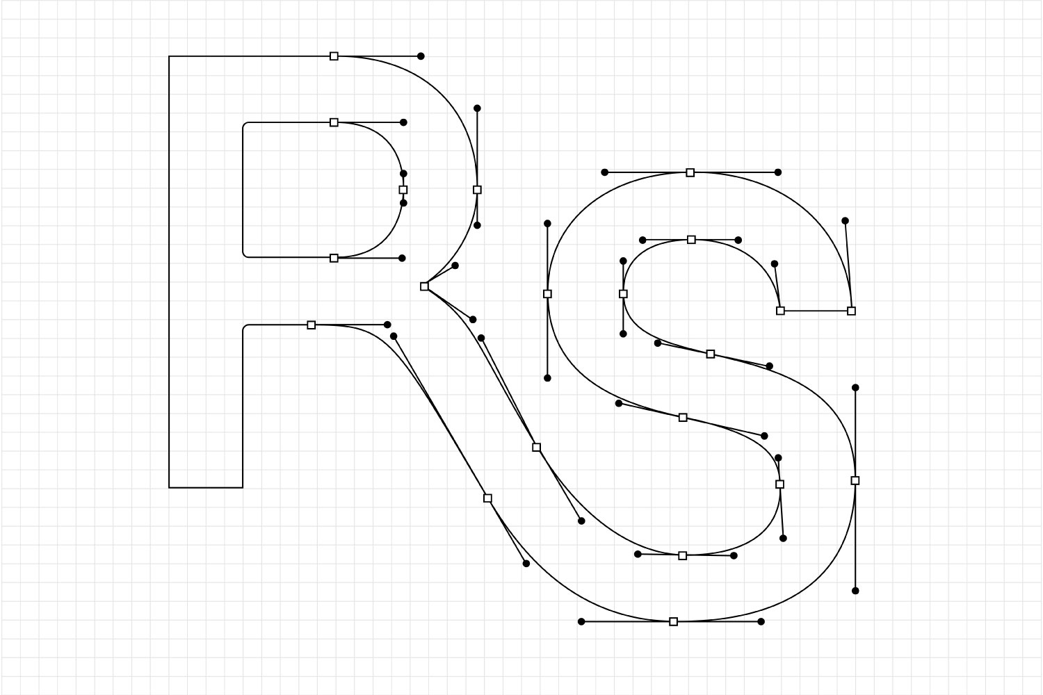
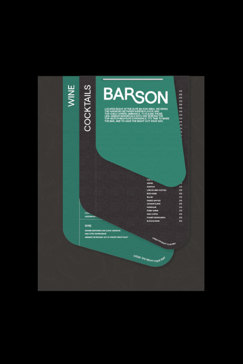
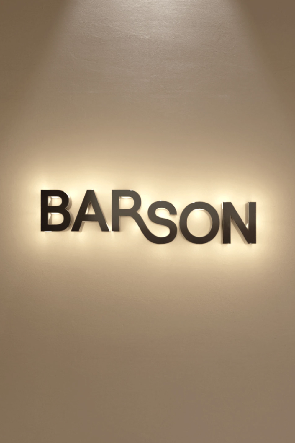
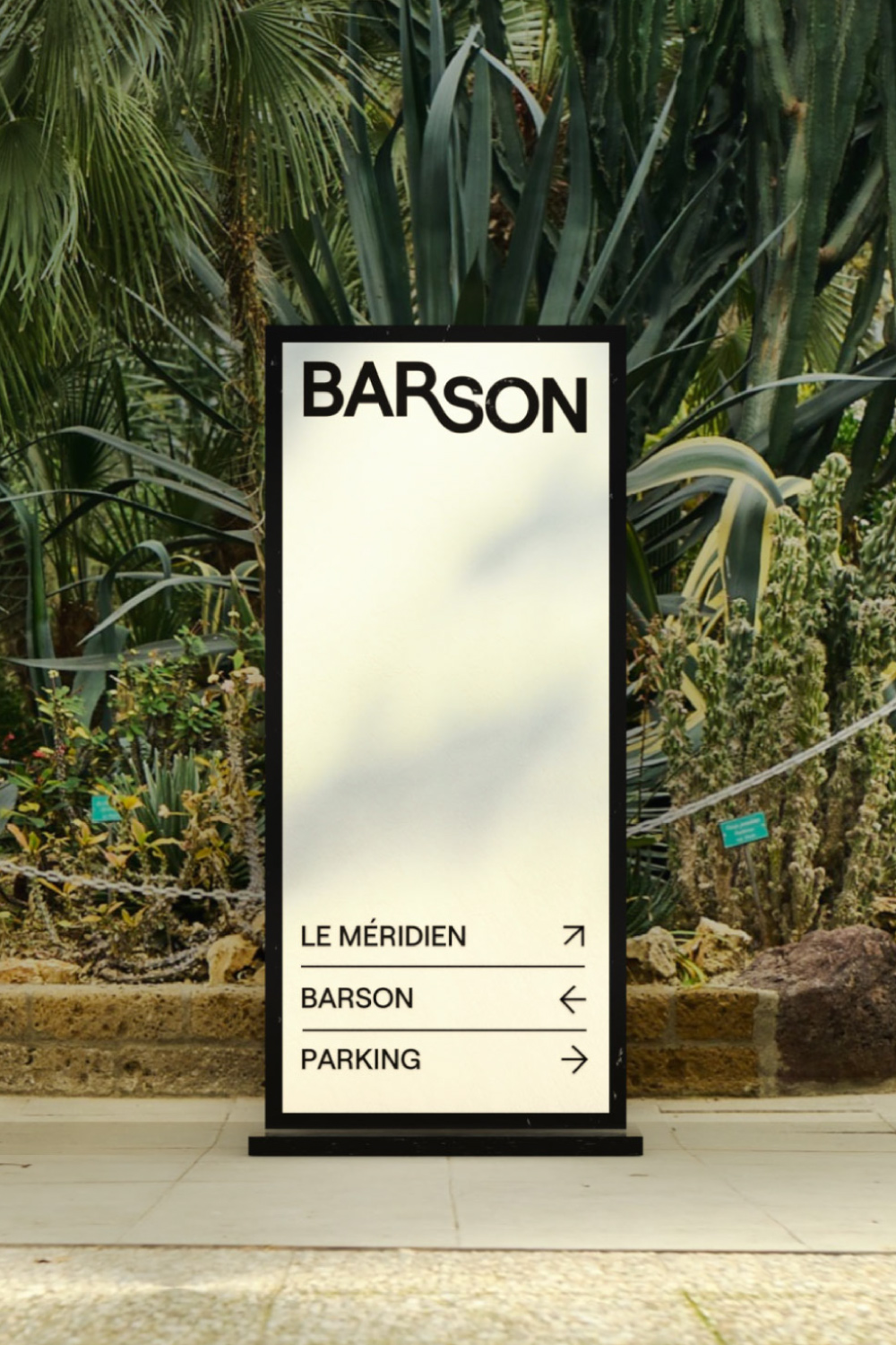
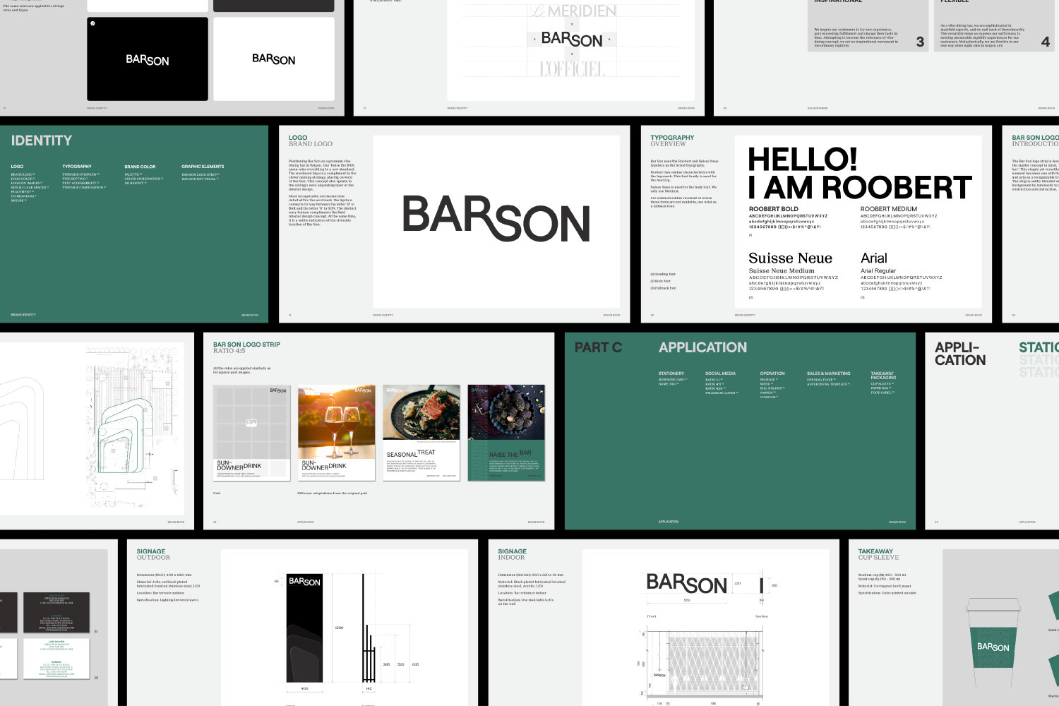
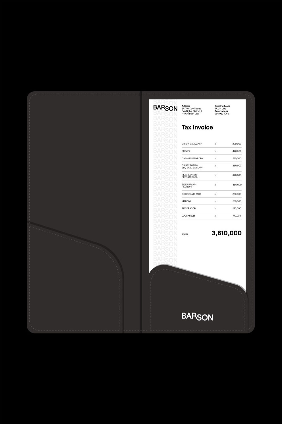
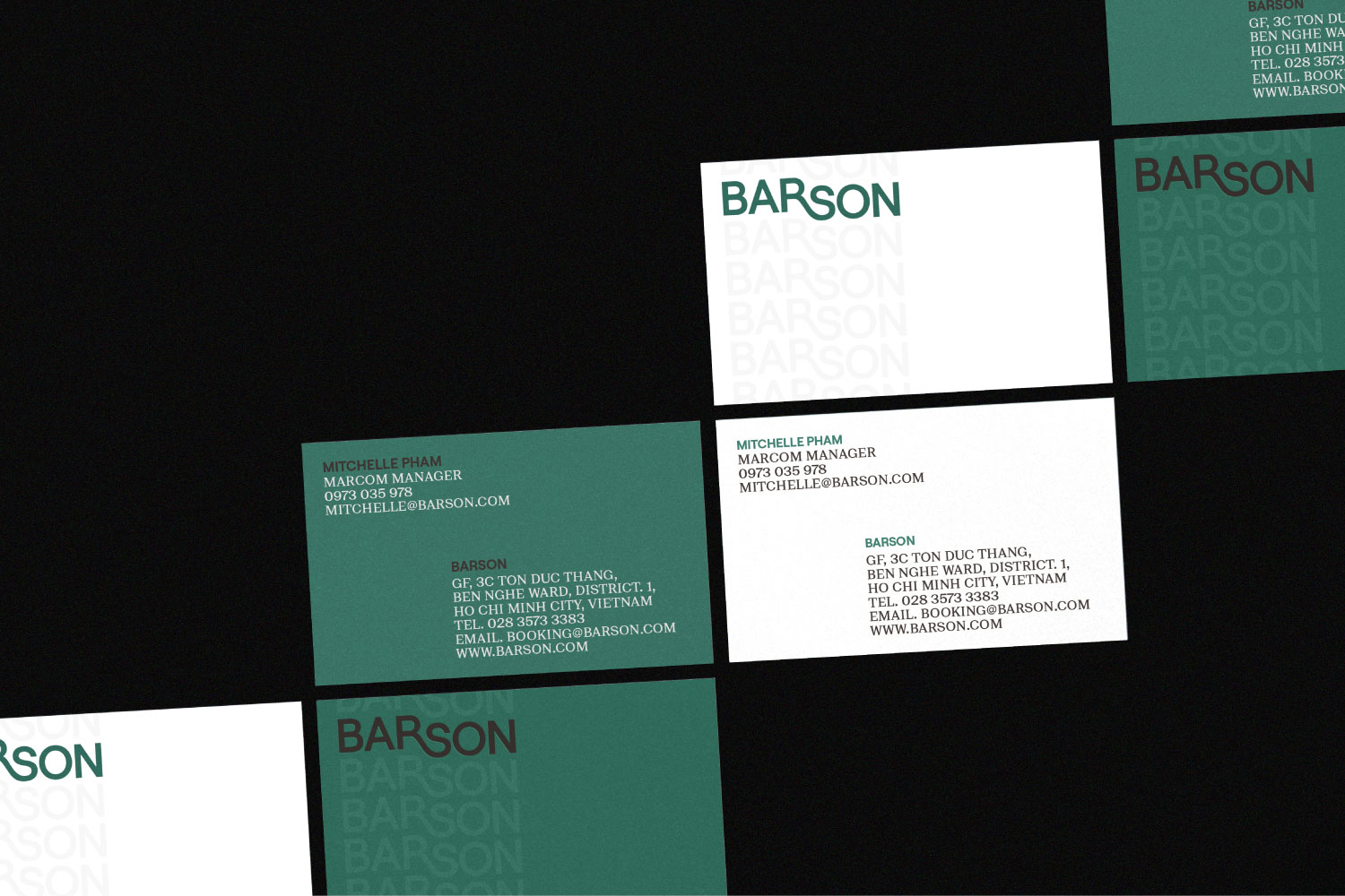
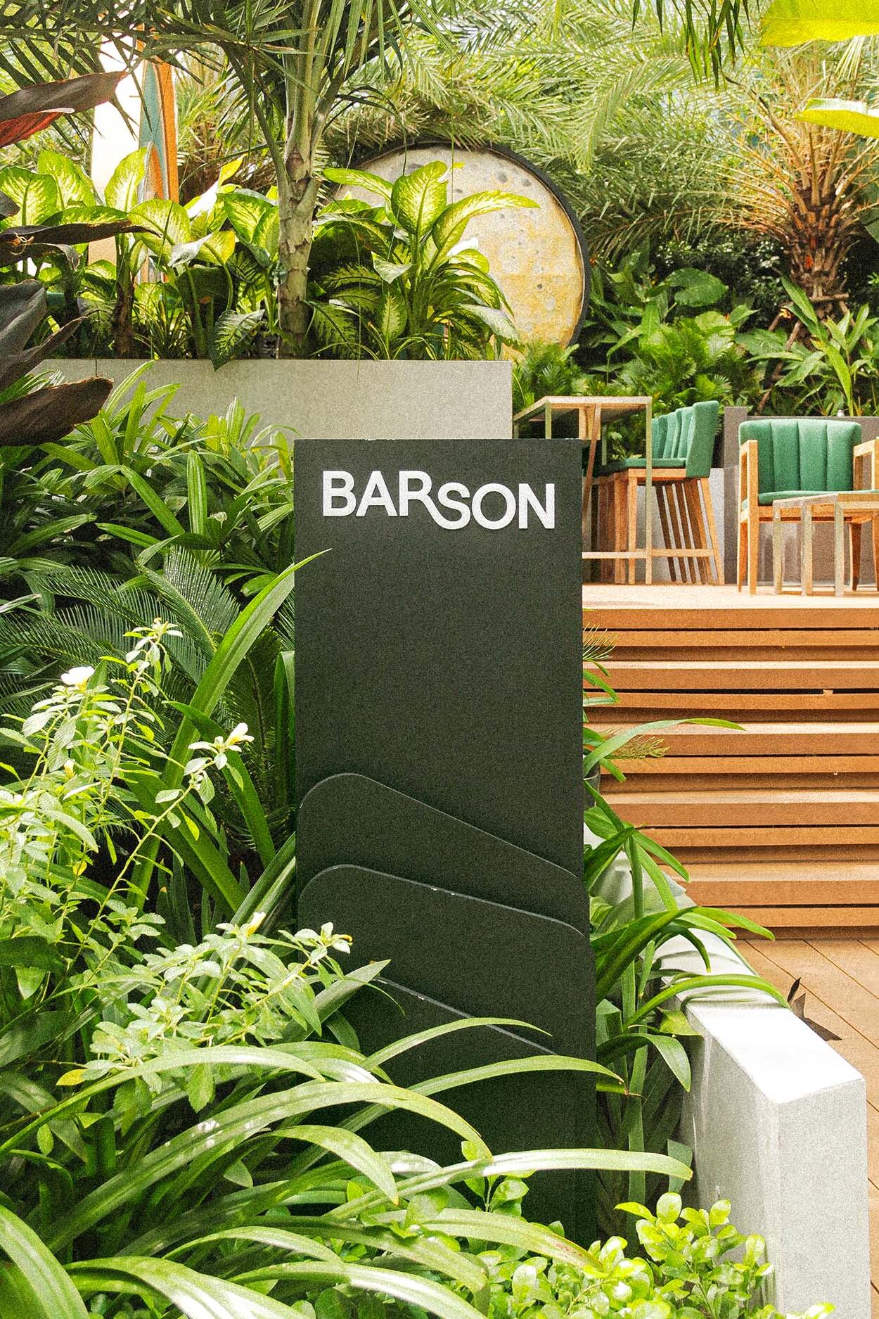
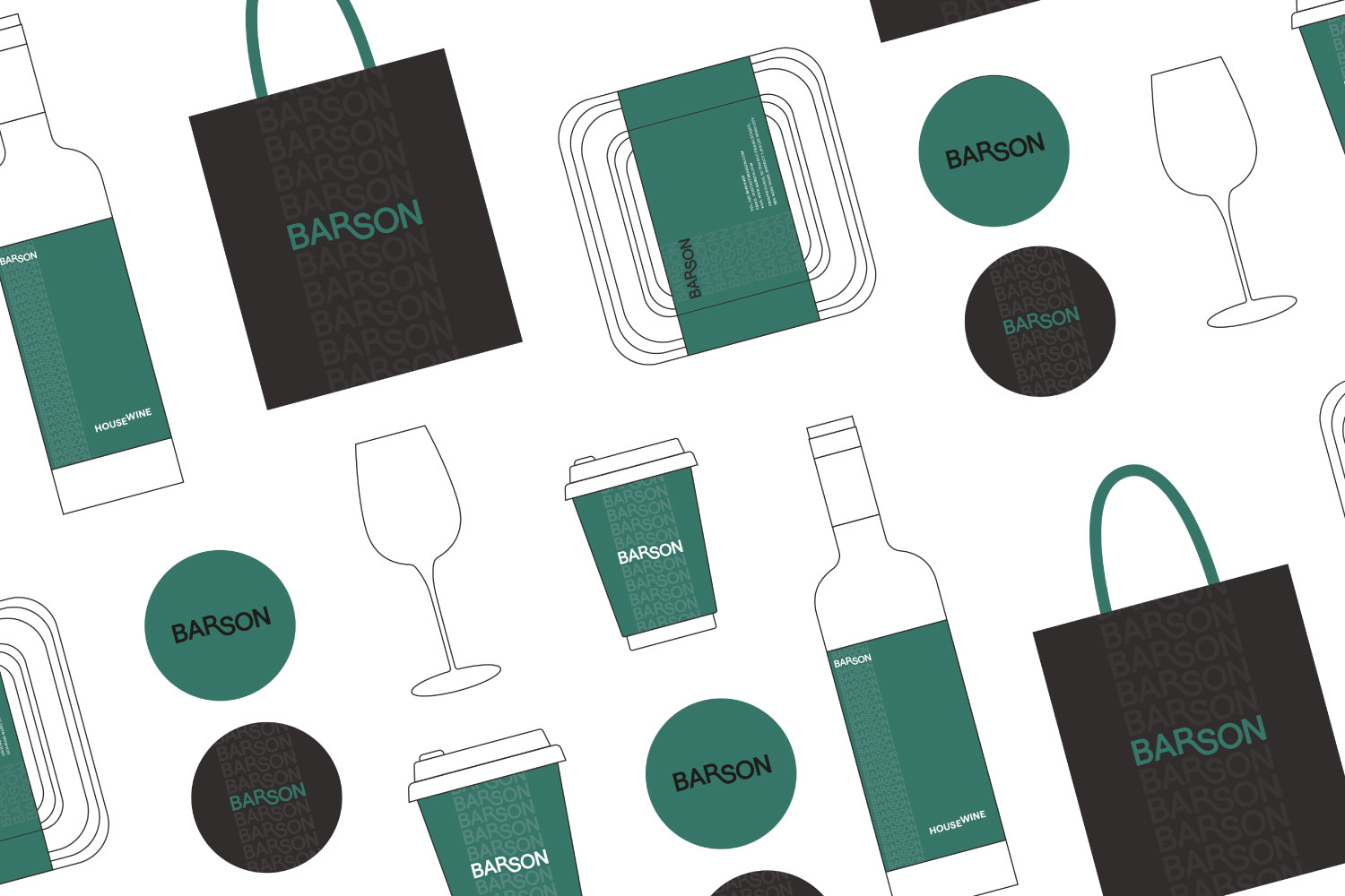
The logo design was a symbolic nod to elevating standards, with a ligature connecting the letters “R” and “S,” symbolizing “A bar that raises the bar.” Accompanied by a color palette blending dark green, grey, black, and white, the design exuded power, mystery, and sophistication. The creation of the “Barson logo strip” offered a versatile and unobtrusive visual asset complementing the logo seamlessly.
Result
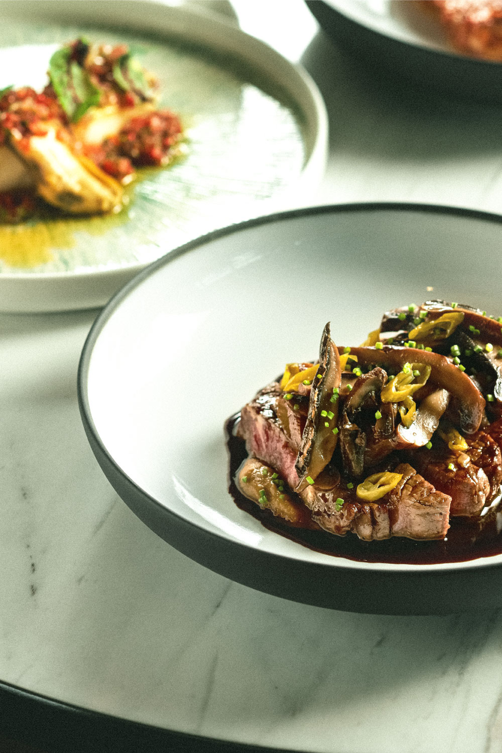
From conceptualization to welcoming its inaugural guests, Barson transformed into a vibrant haven, offering an immersive experience that combined lively vibes and exceptional cuisine. The fusion of heartwarming ambiance and delectable cuisine marked Barson’s entry, promising to redefine entire night-outs for those seeking a sophisticated destination.


