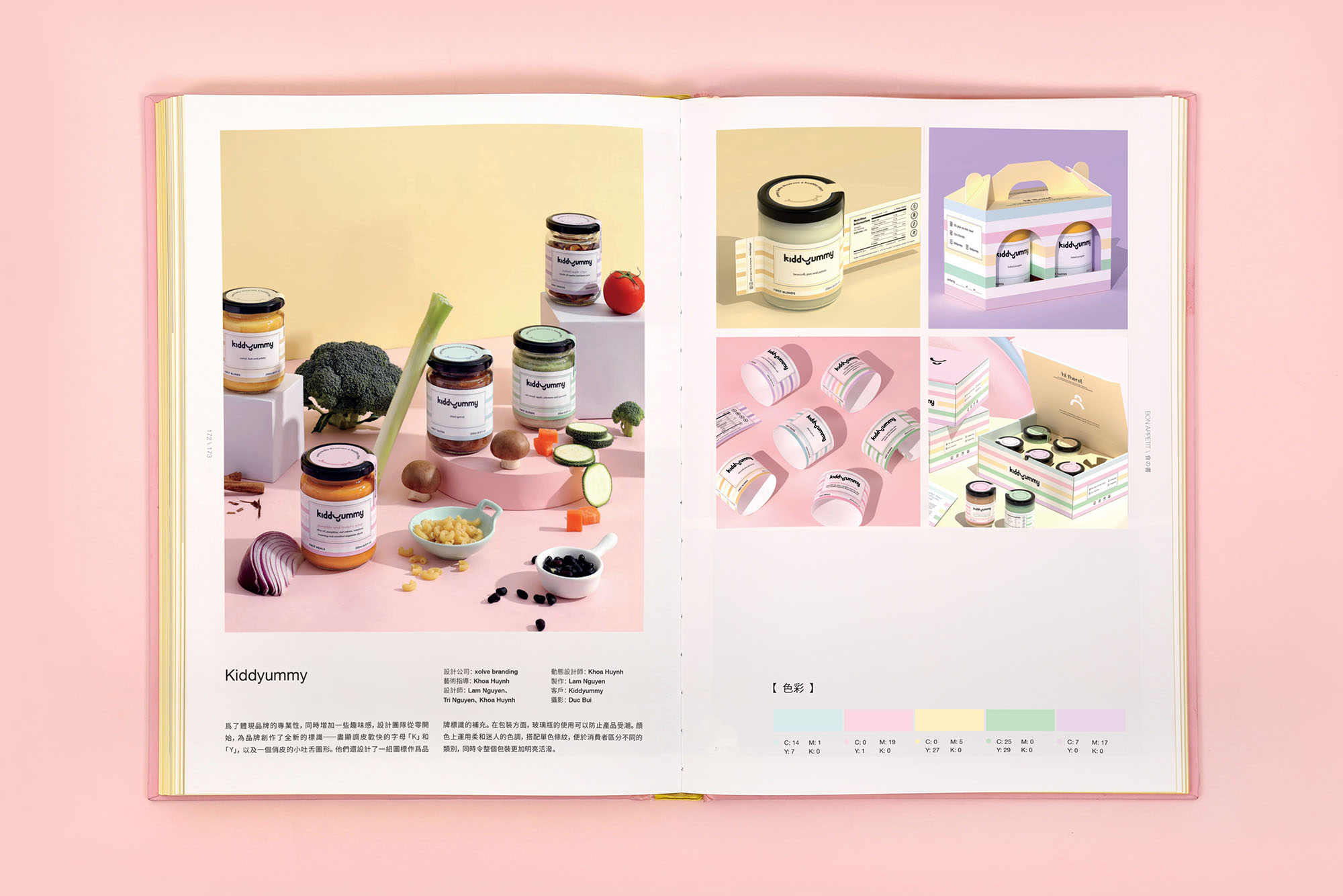
We’re thrilled to announce that our work with Kiddyummy has been recognized in Sandu Publishing‘s “Bon Appetit” book! This publication explores the art of food packaging design, showcasing innovative and effective approaches from around the globe.
For those unfamiliar with Kiddyummy, it’s a startup born from a mother’s desire to provide convenient and nutritious baby food options. We partnered with them to develop a brand identity and packaging that truly captured their commitment to quality, safety, and – importantly – playfulness!

A Recipe for Branding Success
Our approach was a multi-faceted journey, combining strategic thinking with creative execution:
- Crafting a playful, yet professional, wordmark: The key was to strike a balance between childlike wonder and parental trust. We achieved this with a mischievous "K" and a jolly "Y" featuring subtle tongue-like details. This playful touch perfectly embodies the brand's child-centric focus while maintaining a sense of professionalism that resonates with parents.
- Developing a vibrant and versatile visual system: Beyond the wordmark, we created a set of custom icons that complement the brand's identity. These icons not only enhance the visual appeal but also add versatility to the brand's communication, allowing for playful applications across various touchpoints.
- Creating a clear and informative packaging system: Kiddyummy offers a diverse product line (First Taste, First Meals, First Blends, First Snacks) to cater to different stages of infant development. To ensure clarity and ease of navigation for parents, we opted for clear glass jars that showcase the quality of the food while also promoting safety. A soft, inviting color palette with monochromatic stripes differentiates each category, contributing to an overall cheerful aesthetic that aligns with the brand's personality.

Being featured in “Bon Appetit” is a significant achievement for xolve and Kiddyummy. It validates our collaborative approach and highlights the impact of thoughtful branding and packaging. This recognition underscores how effective design can not only communicate a brand’s values but also forge a deep connection with its target audience. In Kiddyummy’s case, the design serves as a visual promise of quality, safety, and transparency, inviting parents to trust their products and feel confident in nourishing their little ones.
More Than Just a Pretty Package
At xolve, we believe that good design transcends mere aesthetics. It’s about delving into the heart of a brand, understanding its core values, and translating them into a compelling and resonant visual language. We’re incredibly proud to have partnered with Kiddyummy on this journey, and we’re excited to witness their continued success in the baby food market.
To learn more about our collaborative process and the intricate details of the Kiddyummy project, check out our comprehensive case study. And don’t miss the opportunity to pick up a copy of “Bon Appetit” to see Kiddyummy’s feature and explore other inspiring examples of food packaging design that are shaping the industry!

