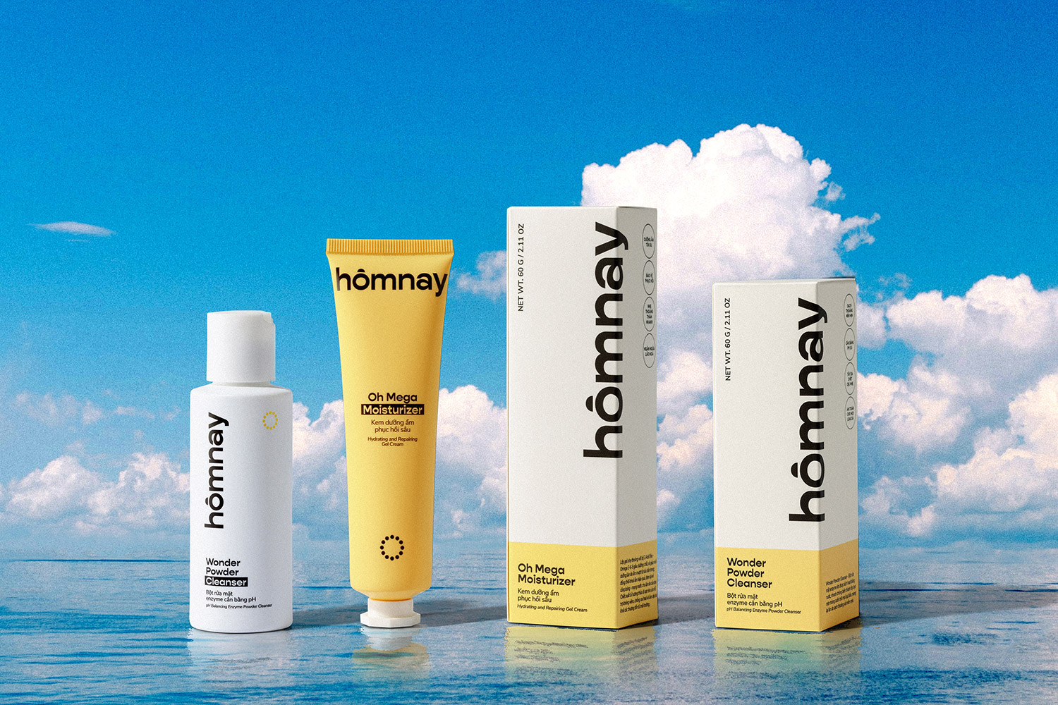
We’re excited to announce that our branding and packaging design for hômnay beauty has been featured on The Dieline! This leading packaging design publication recognized hômnay for its refreshing approach to skincare in a cluttered market.
The Dieline praised hômnay’s commitment to simplicity and authenticity, highlighting how the brand’s visual identity effectively communicates its core values of ease, quality, and adaptability to modern urban lifestyles.

Simplifying Skincare for the Modern Individual
hômnay beauty was born from the need to simplify skincare decision-making. In a world saturated with options, it can be overwhelming to find the right products and routines. hômnay cuts through the noise, offering streamlined solutions that cater to diverse needs and busy lifestyles.
How We Brought hômnay to Life
Our design approach focused on capturing the brand’s essence through:
- A timeless logo: The clock-inspired logo, featuring 12 timestamps, represents the brand's philosophy of starting fresh "today" and embracing a simple, consistent skincare routine.
- A calming color palette: The warm blend of yellow and sky blue evokes feelings of sunshine and tranquility, reflecting the brand's promise of radiant, healthy skin without the stress.
- Clear and concise packaging: The minimalist design prioritizes essential information, making it easy for consumers to understand the product's benefits and usage
Cutting Through the Clutter
In a market saturated with skincare options, hômnay beauty stands out with its clear message and minimalist aesthetic. The brand’s commitment to simplicity and authenticity resonates with consumers who are looking for effective solutions without the complexity.
Being featured on The Dieline is a testament to the power of design in communicating brand values and connecting with consumers. We’re proud to have partnered with hômnay beauty on this journey, and we’re thrilled to see their continued success in the skincare industry.

