Client
Hoang Dung
Sector
Agriculture
Discipline
Brand identity
Packaging
Project team
Thao Anh Le
Quynh Ai
Linh Phan
Thanh Binh
Thanh Ngoc
Jackbabe
Khanh Linh
Khoa Huynh
Challenge
For over 30 years, Hoang Dung had established itself as a trusted name in the Vietnamese fertilizer industry, committed to both quality and environmental sustainability. However, with a changing market landscape and a desire to appeal to a younger, more diverse audience, the company recognized the need to modernize its brand image and transition to a more premium market position. The existing brand identity no longer reflected their evolving values and aspirations.
Solution
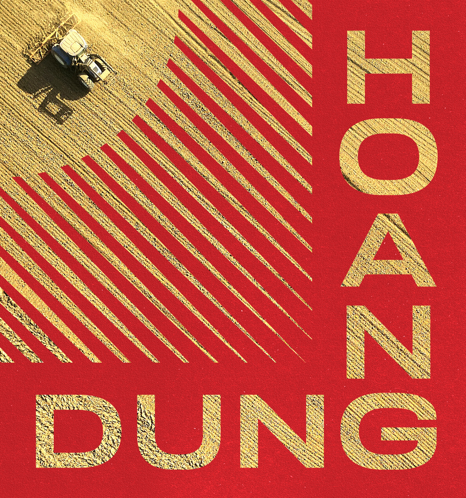
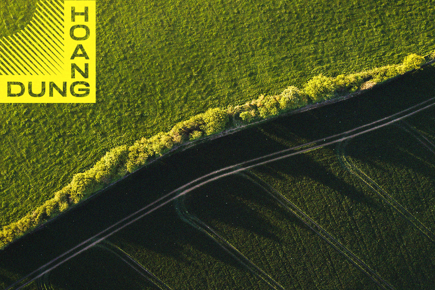
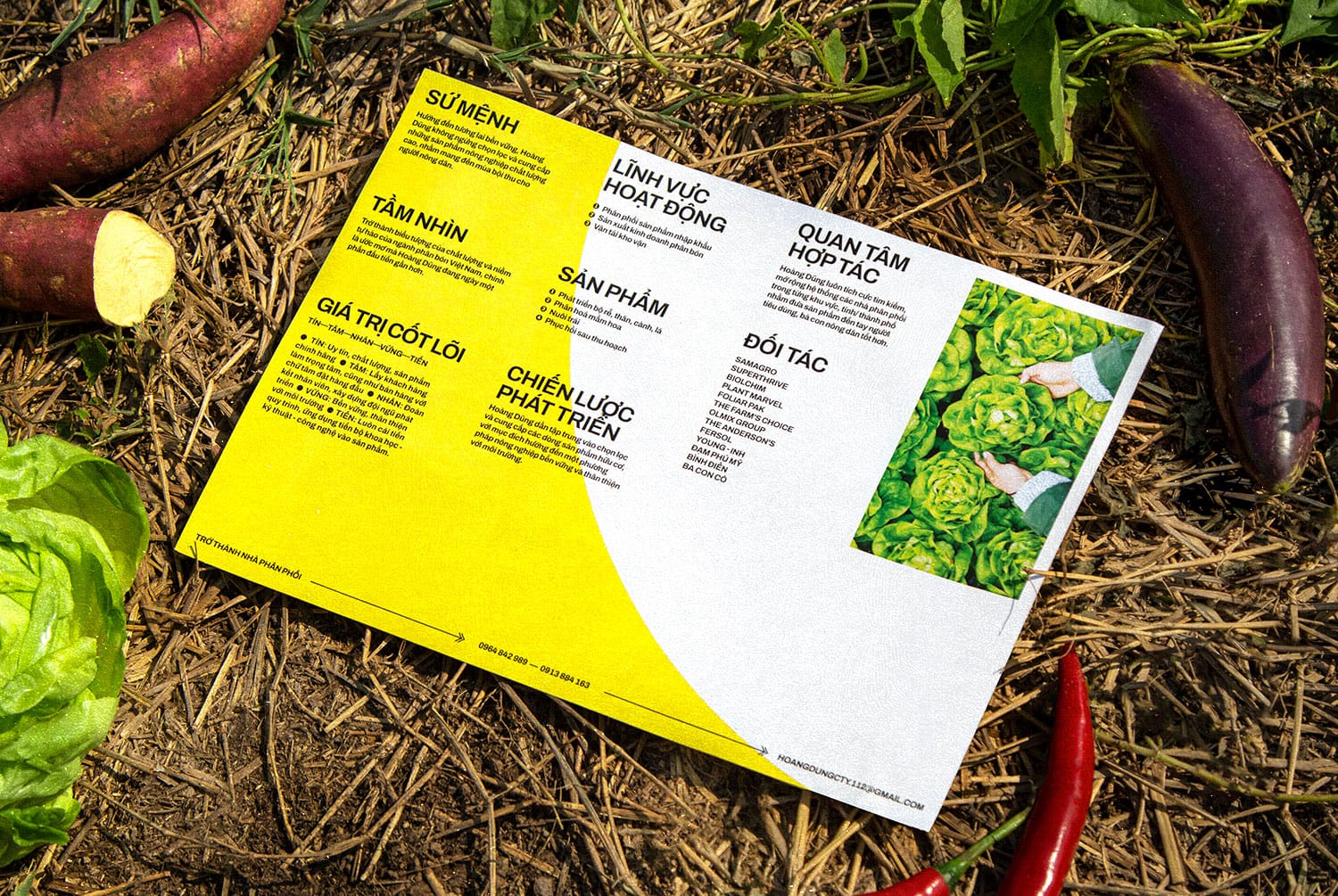
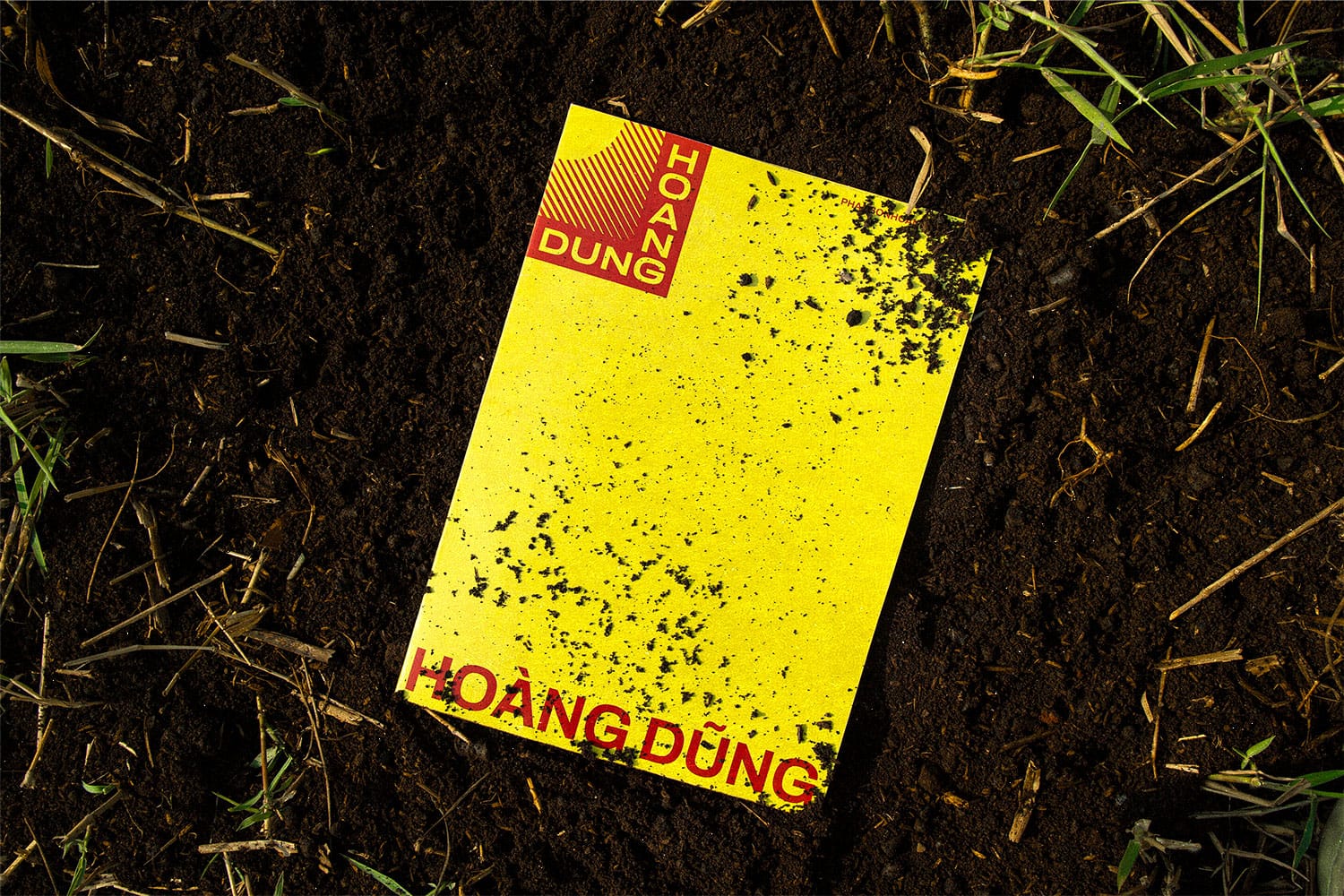
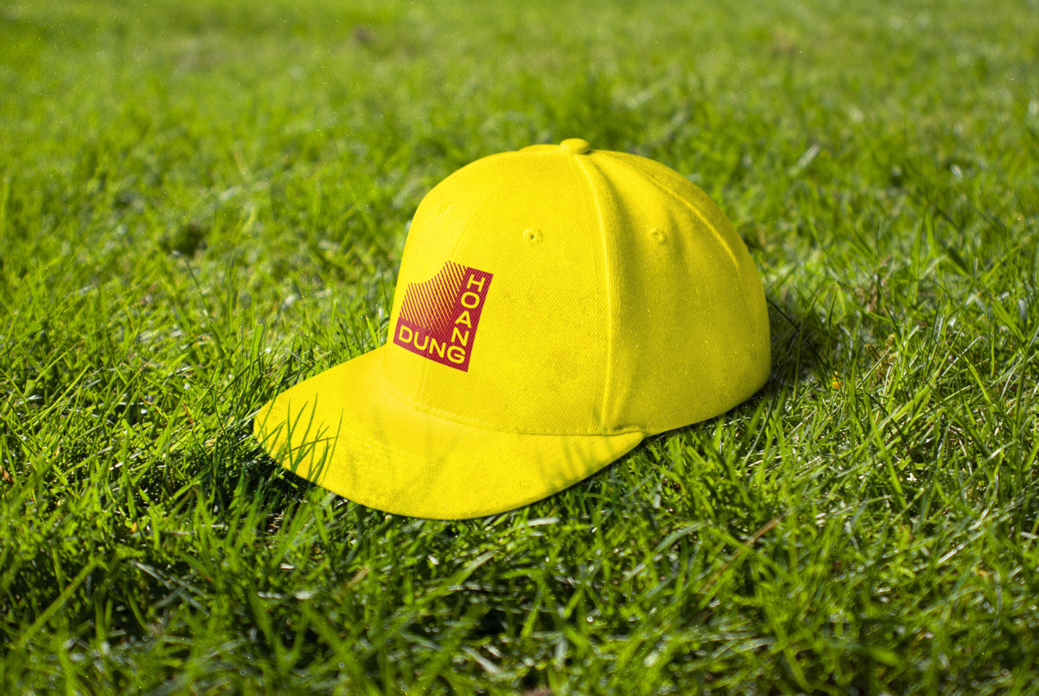
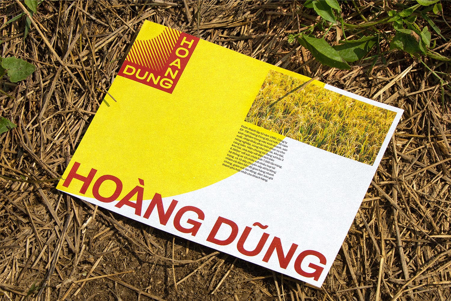
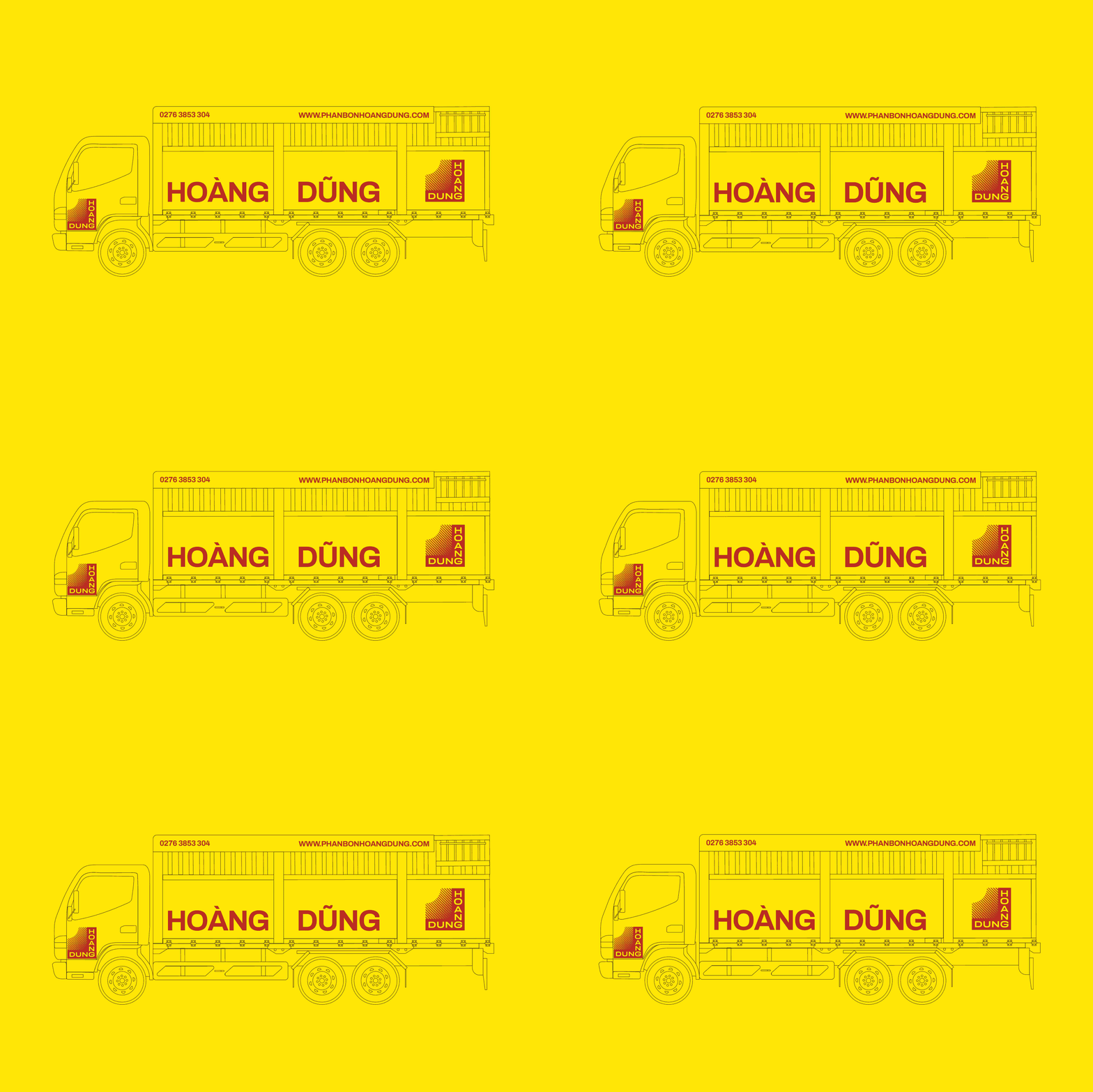
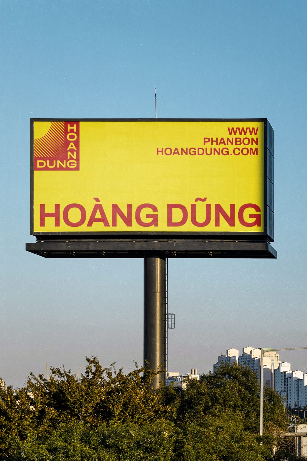
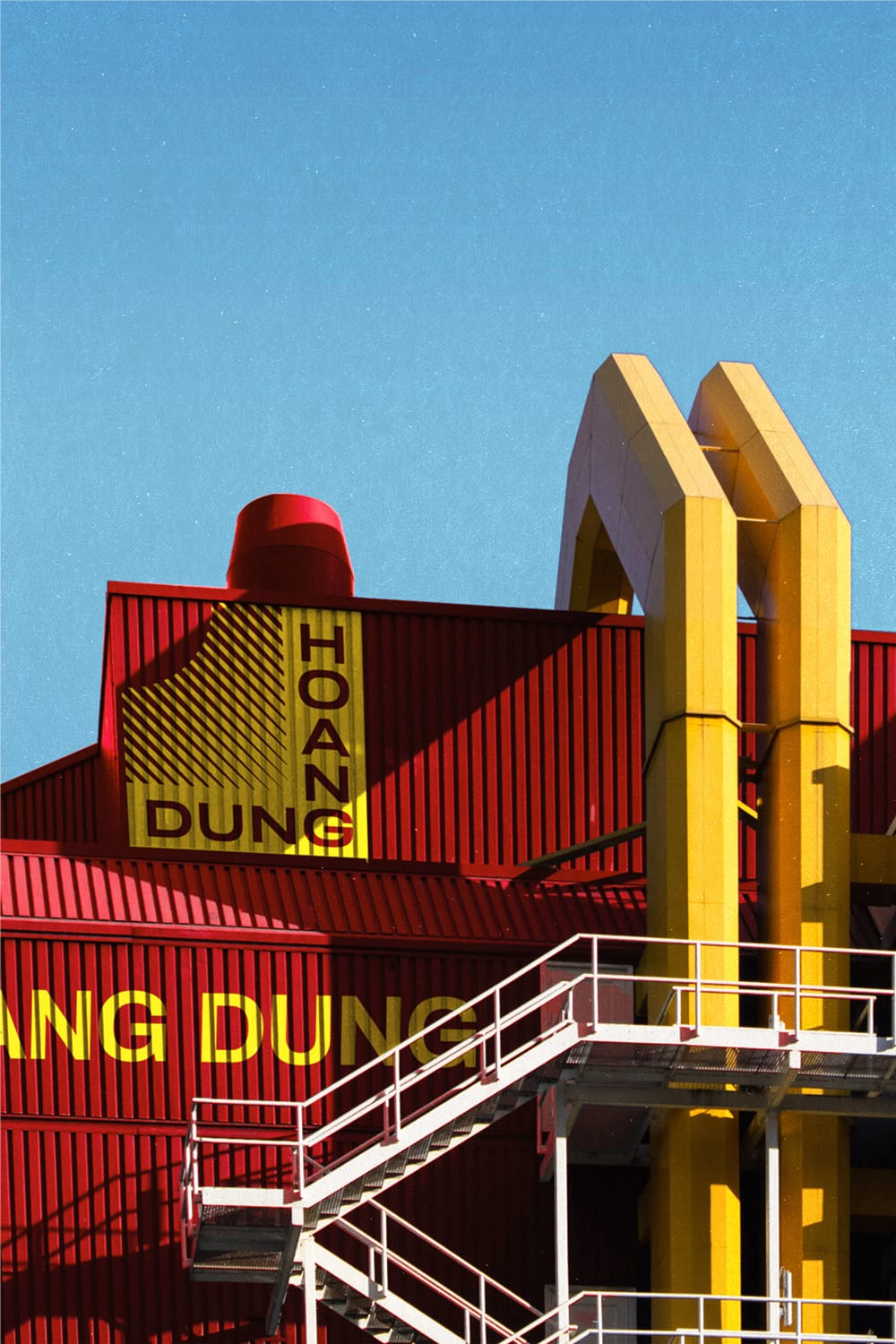
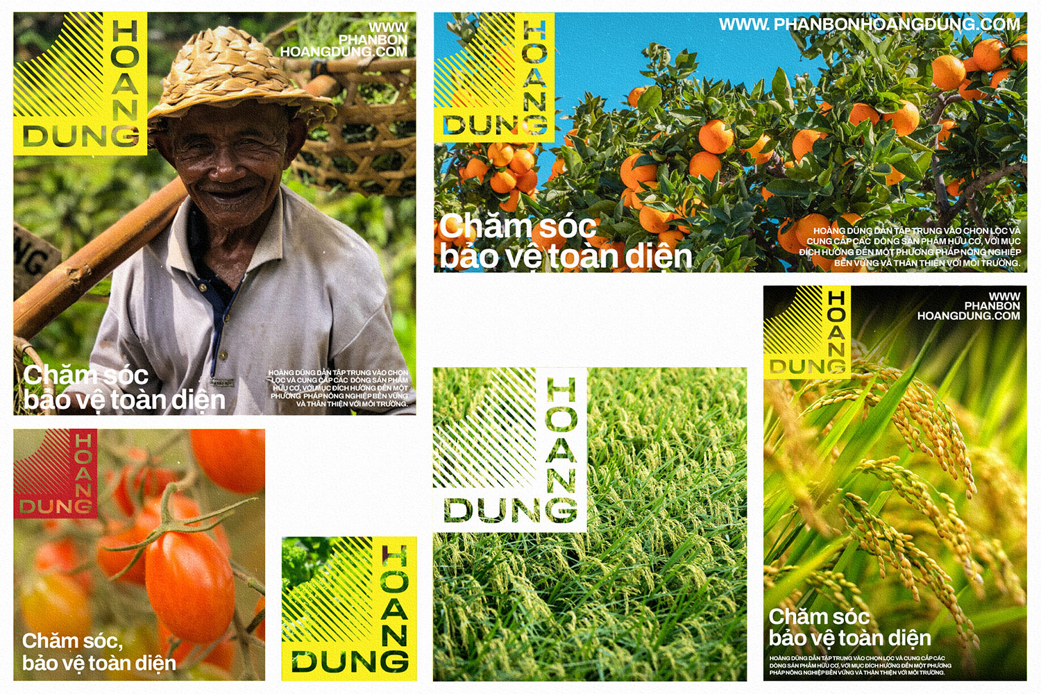
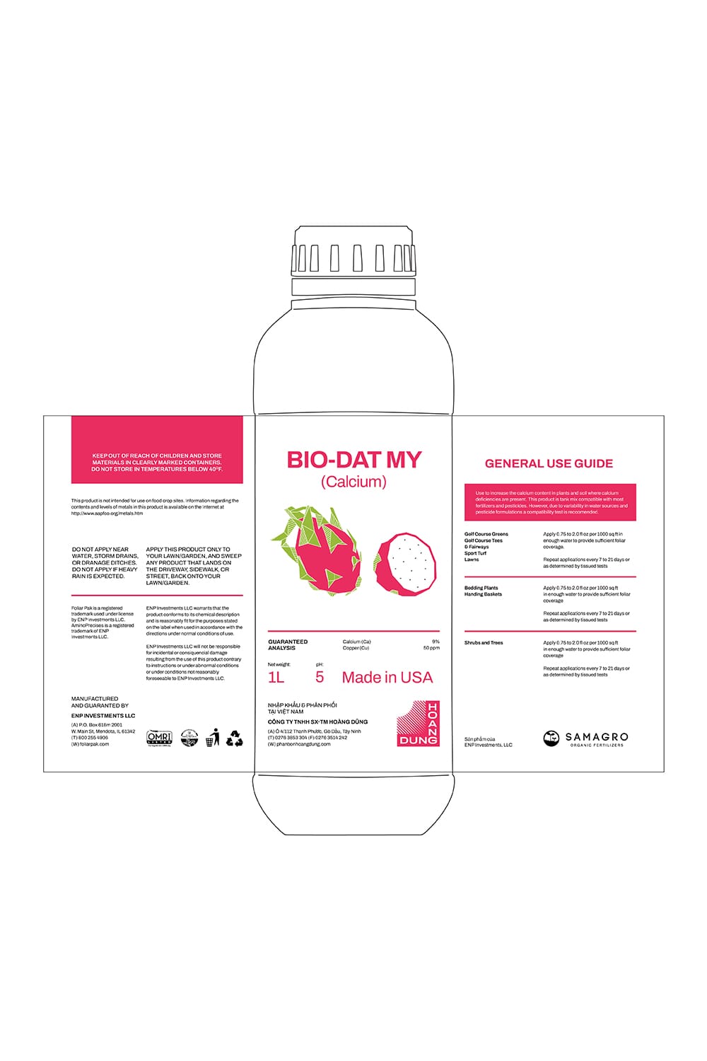
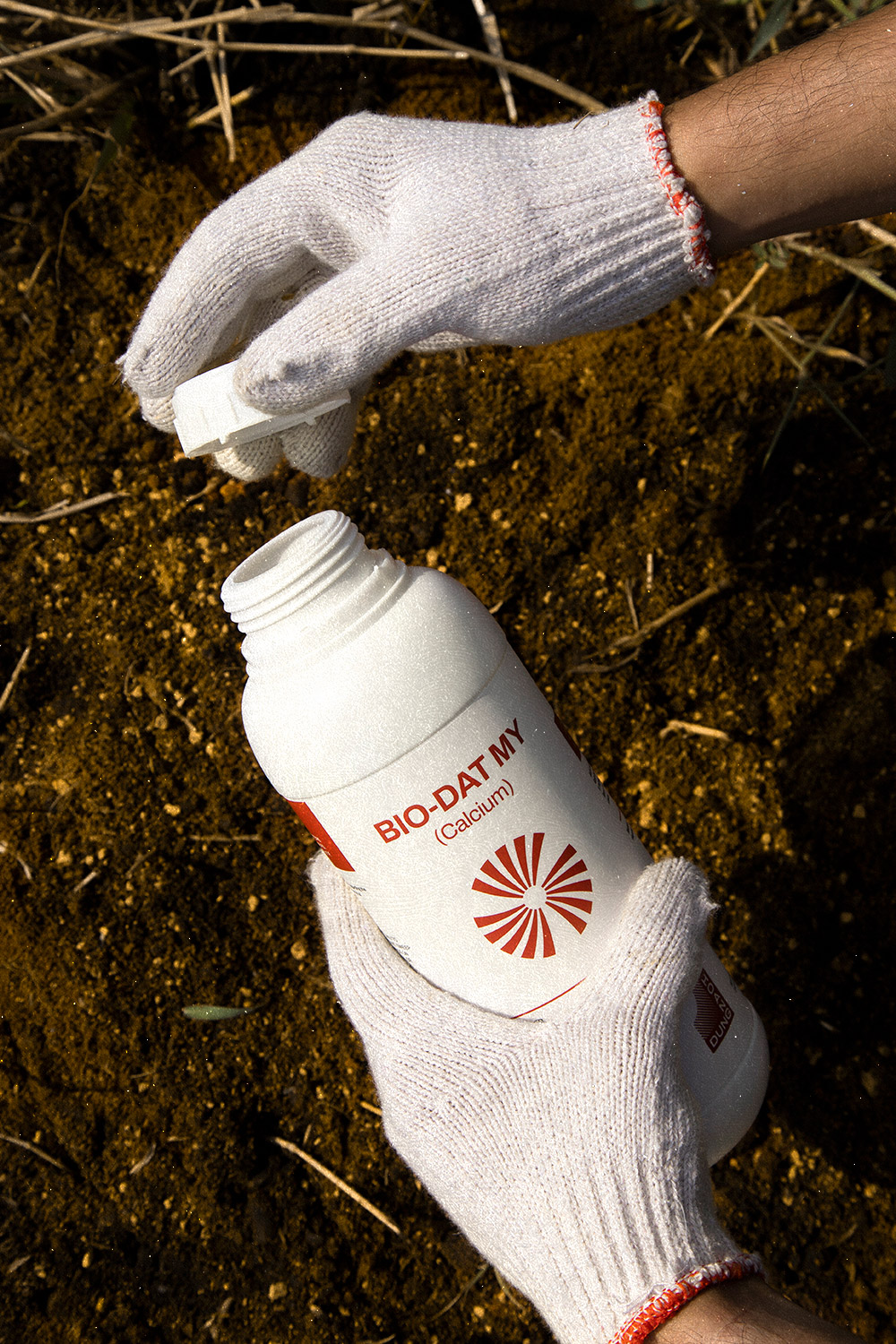
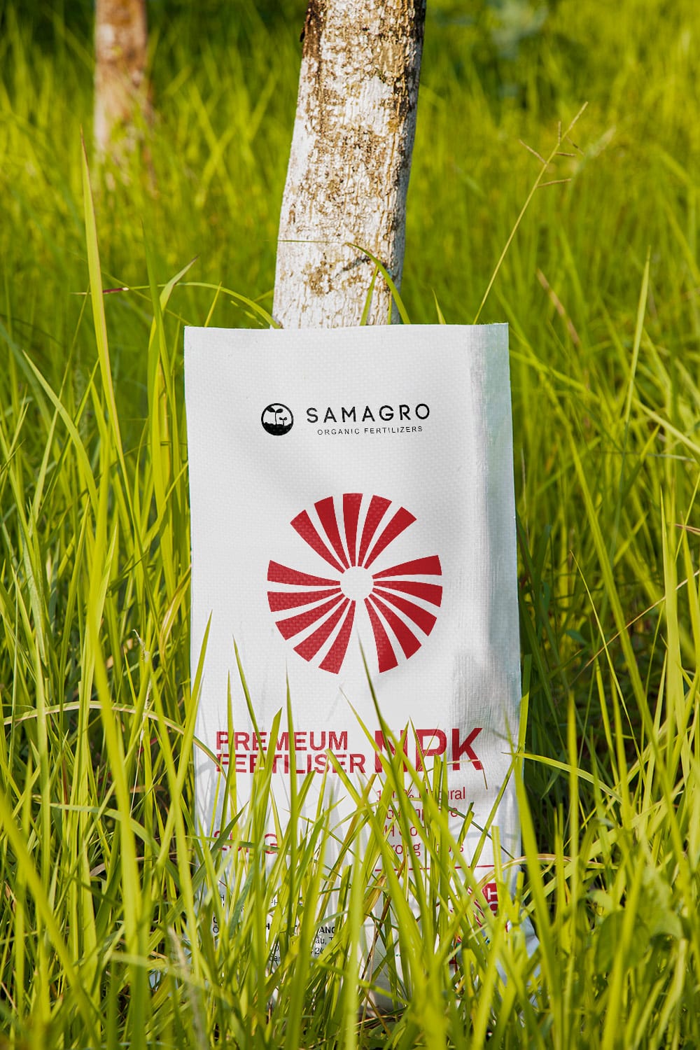
xolve partnered with Hoang Dung to develop a comprehensive rebranding strategy that would capture the essence of the company’s legacy while projecting a fresh, contemporary image. At the heart of the new identity was a versatile and adaptable brand mark. This interplay of shapes features a negative round shape, signifying the sun and symbolizing growth and energy, while the bevelled slashes represent sunlight, dynamism, and vitality. The right-angle configuration of the brand name reflects the company’s role as a foundation for customer success.
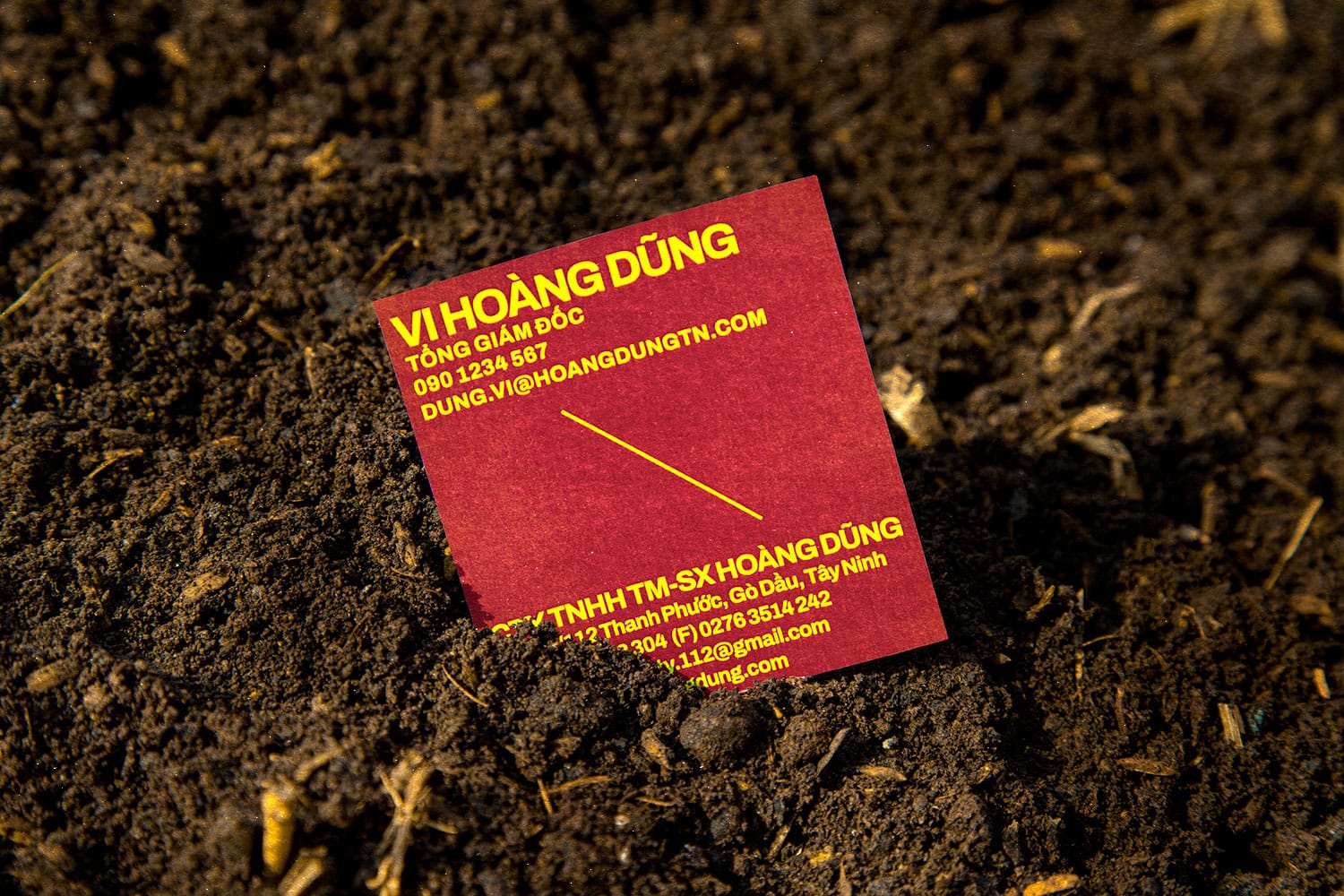
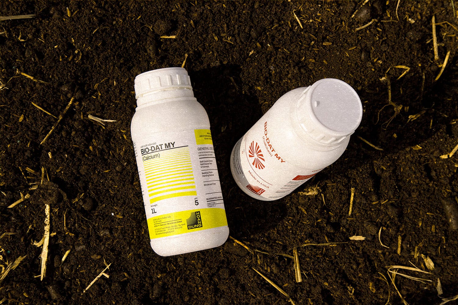
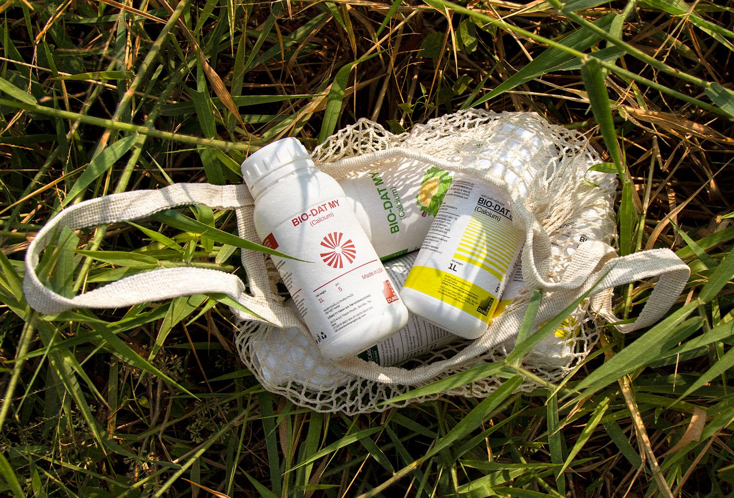
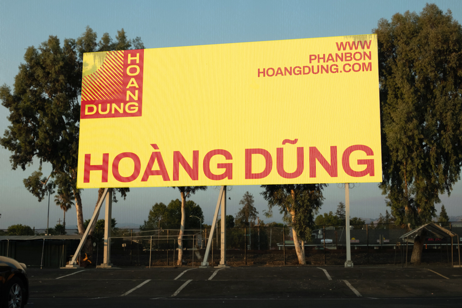
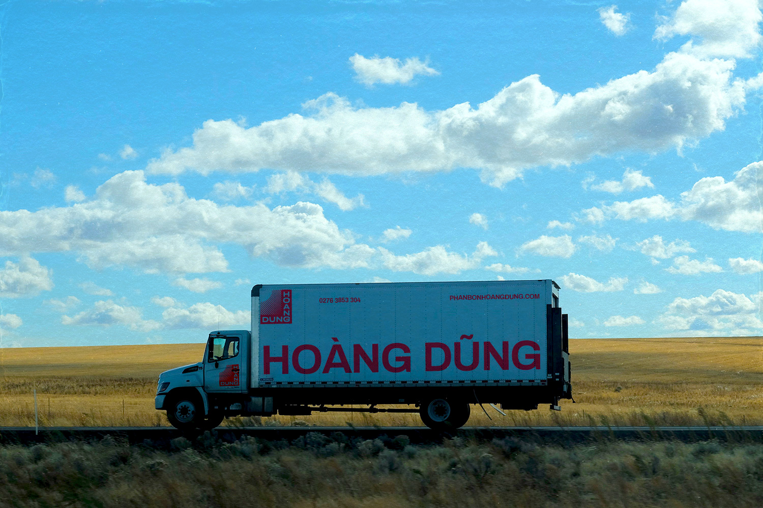
xolve’s design team also crafted a vibrant and eye-catching visual system. Warm, vivid hues of red and yellow serve as the primary brand colors, complemented by cooler, neutral tones like green, purple, blue, and gray. The typeface Archivo, chosen for its balance of modernity, trustworthiness, and subtle confidence, works harmoniously with the other graphic elements to create a cohesive visual language.
The rebranding extended beyond visuals, with a refined messaging strategy that emphasizes Hoang Dung’s mission to provide vital energy and complete protection for a bumper harvest. The diagonal cross motif, appearing across various brand elements, embodies the company’s values of generative, responsive, and professional service.
Result
The rebranding transformed Hoang Dung from a budget-friendly fertilizer provider to a premium leader in organic solutions. The new visual identity reflected their commitment to quality and innovation, while the modern and simple design allowed their products to take center stage. This strategic refresh ensured Hoang Dung was well-positioned to attract a new generation of farmers and cultivate continued success.
